Reducing errors to increase completion in a rigorous checkout process
👨💻My Role:
Lead UX designer responsible for interaction design, design systems contribution, design direction socialization, crossfunctionally collaborating with product manager, technical product manager, research, content partners and brand partners.
Platform: Responsive Web
Tools used: Paper and Pencil, Figma, Invision app, Zeplin
CUSTOMER PROBLEM
🤬
Many customers struggle to check out when placing an order online
Errors
Difficulty locating errors
Research told us that customers were trying to proceed through checkout but were unable to because of missing or incorrectly completed fields. Customers would continue to the end of the page and rage click at a disabled button taking them to the next step. Customers who had errors preventing them from moving forward either never knew it and/or couldnt find them and thus could not self correct.
Error prone fields and forms
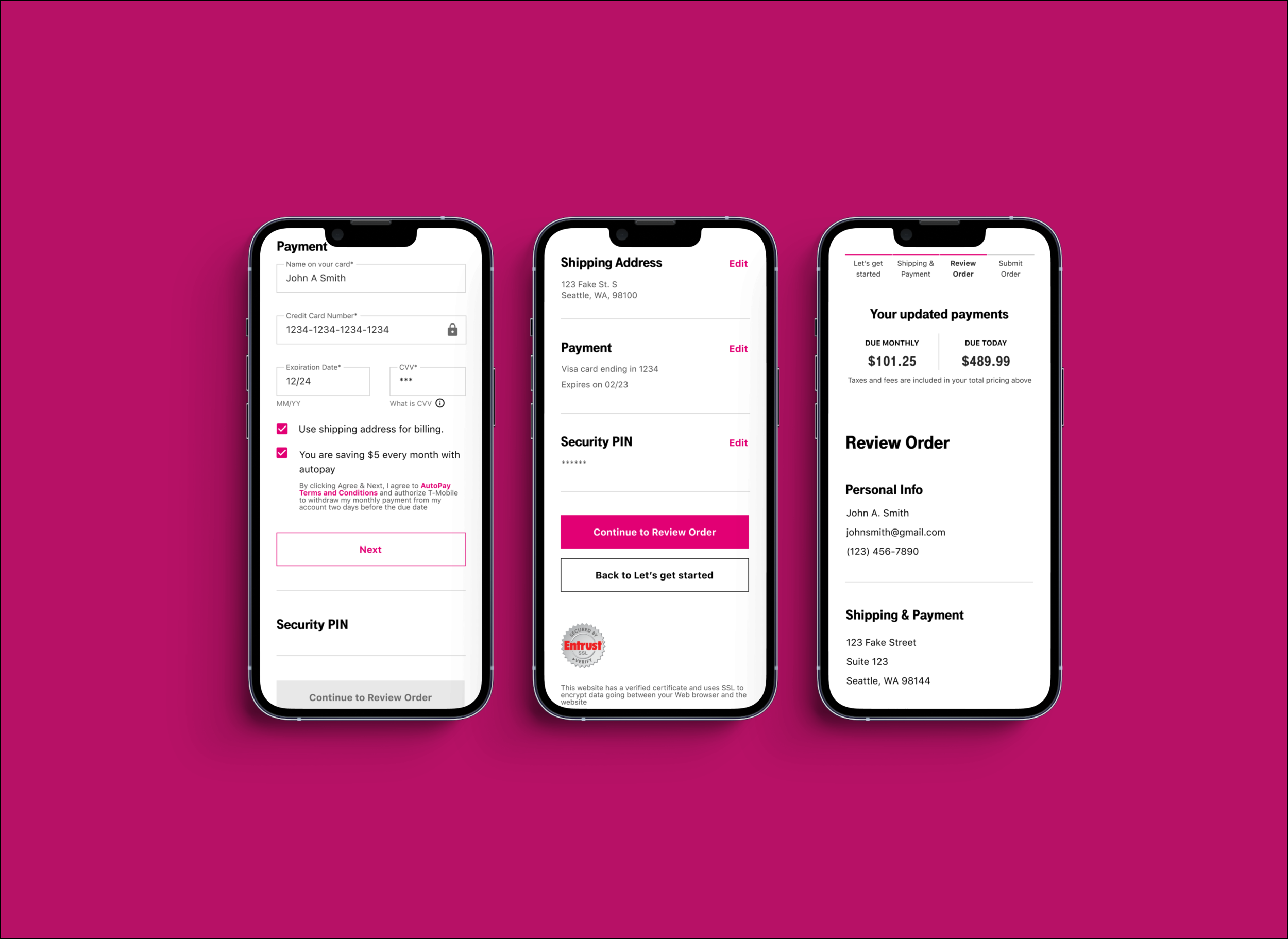
With little to no validation (form or fields) customers were unaware about whether their input was accepted or not. Additionally, customers would skip fields altogether when completing long and exhaustive forms. The latter scenario was particularly troublesome as it would not prompt a field error yet prevent the customer from progressing on to the next step.
BUSINESS OPPORTUNITY
The thing about online orders was they weren’t actual real orders, they were “soft orders”
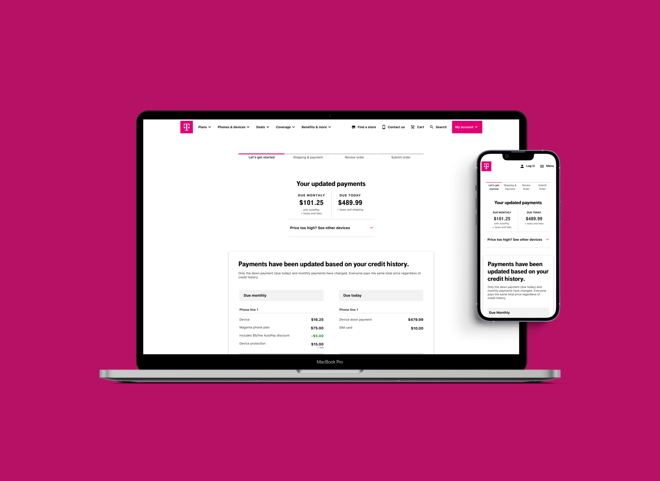
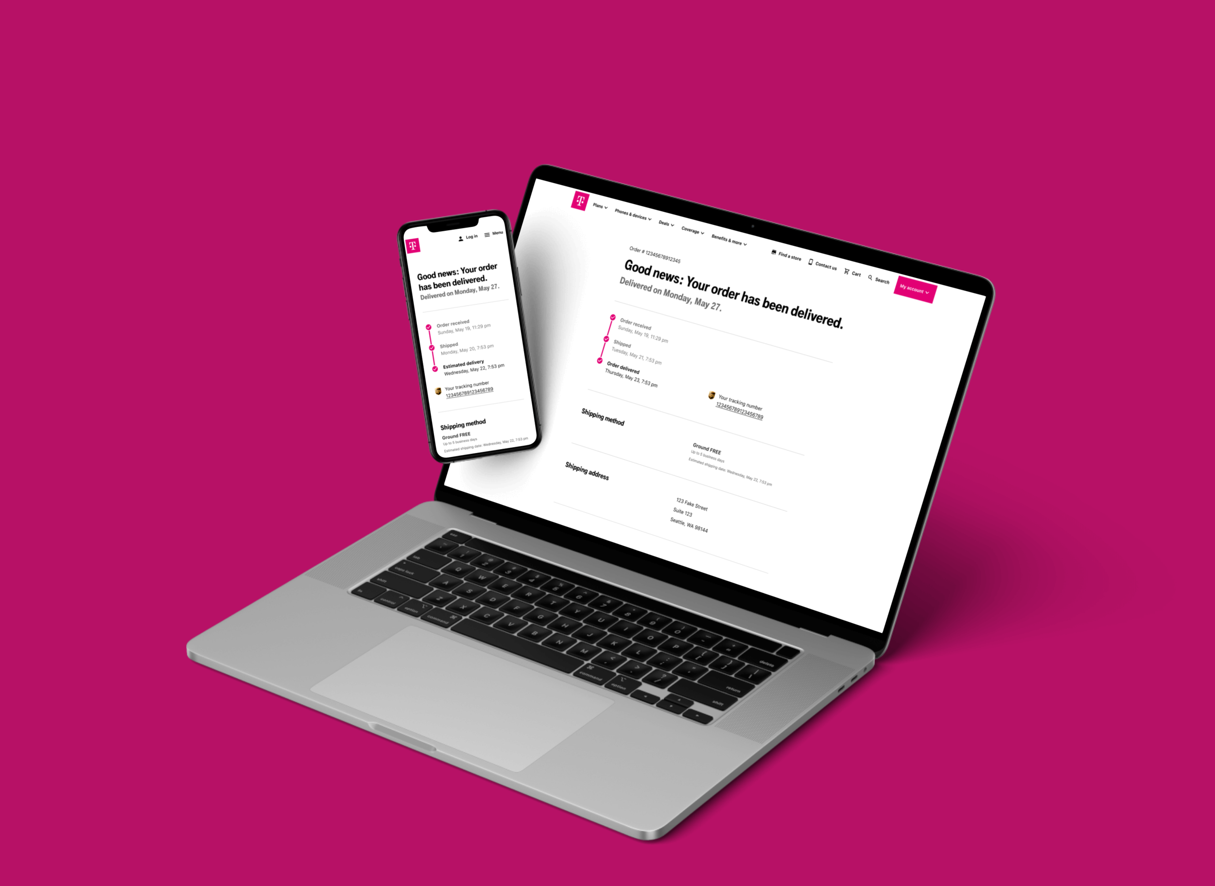
A soft order must be verified by a customer service rep. then they must also send a device contract to the customer. Once that contract has been signed, only then is the “soft order” an actual order. With people shopping more online at the onset of the global COVID-19 pandemic, automating this portion of checkout to reduce fulfillment time but also increase the amount of actual orders was seen as a big priority and opportunity.
🤔
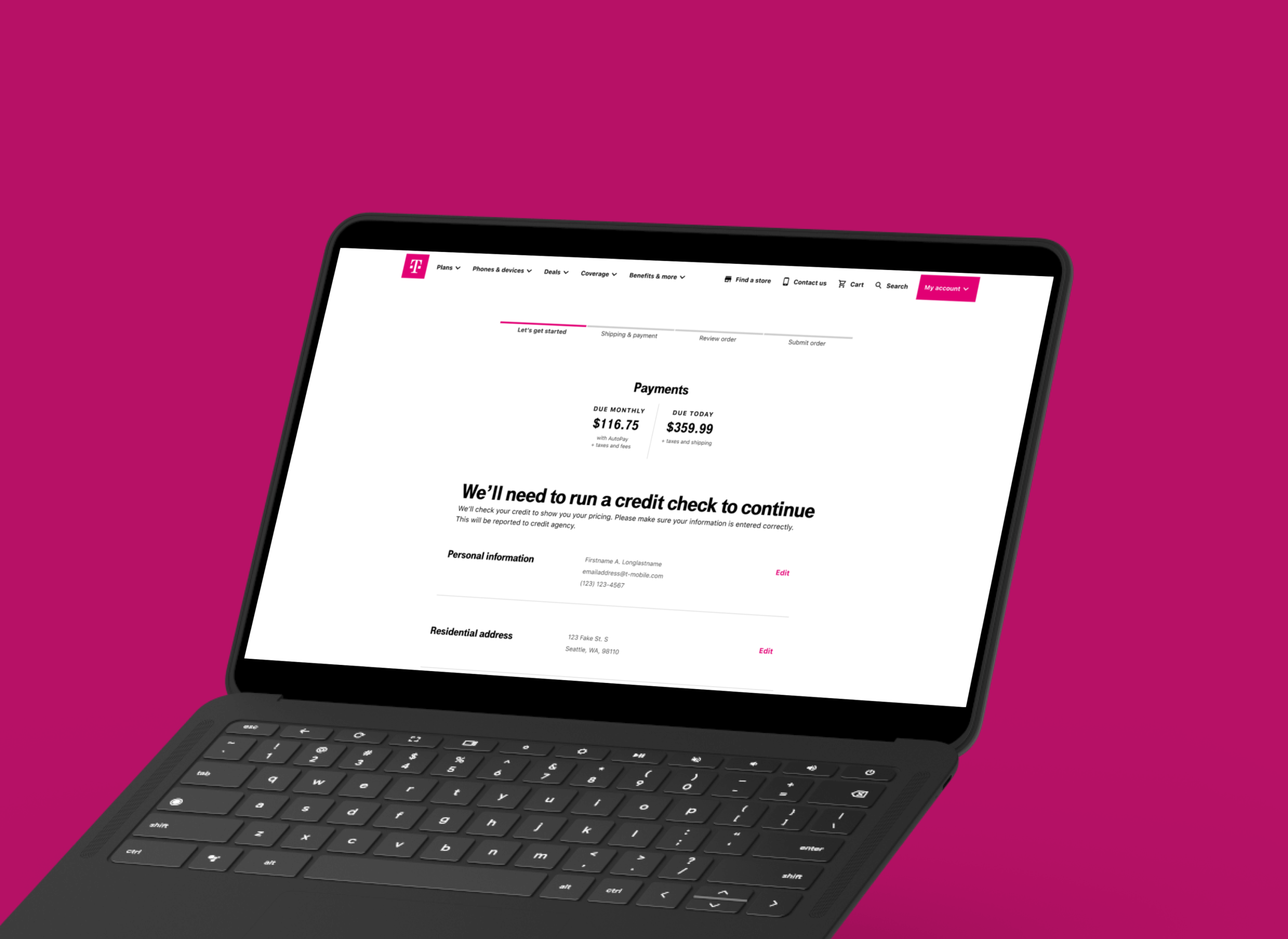
How might we design checkout that automates the order process while also reducing errors to increase completion?
Moving fast
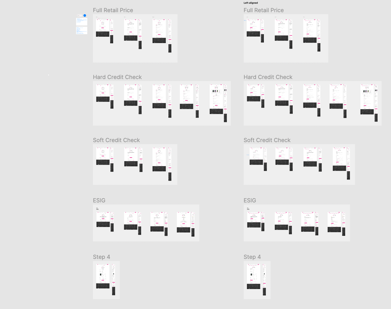
Since there was a lot of work to complete on the engineering side, we as a team decided to build a parity experience to legacy checkout first. This enabled the engineering team to build the new checkout with a new design system and API integrations while I focused on UX opportunities.
Identifying new edge cases
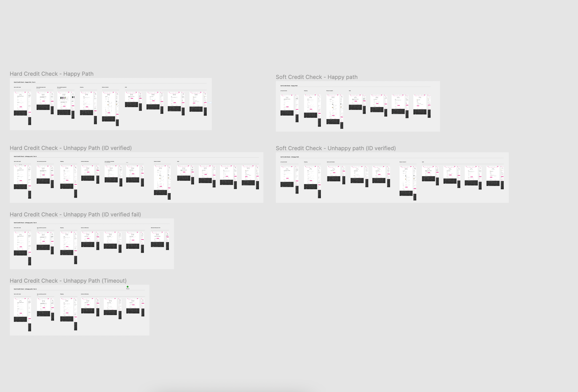
Once we had the basic building blocks in development we focused on edge cases. The order automation required new functions which meant more edge cases like validations, failures and modified task flows.
About those errors
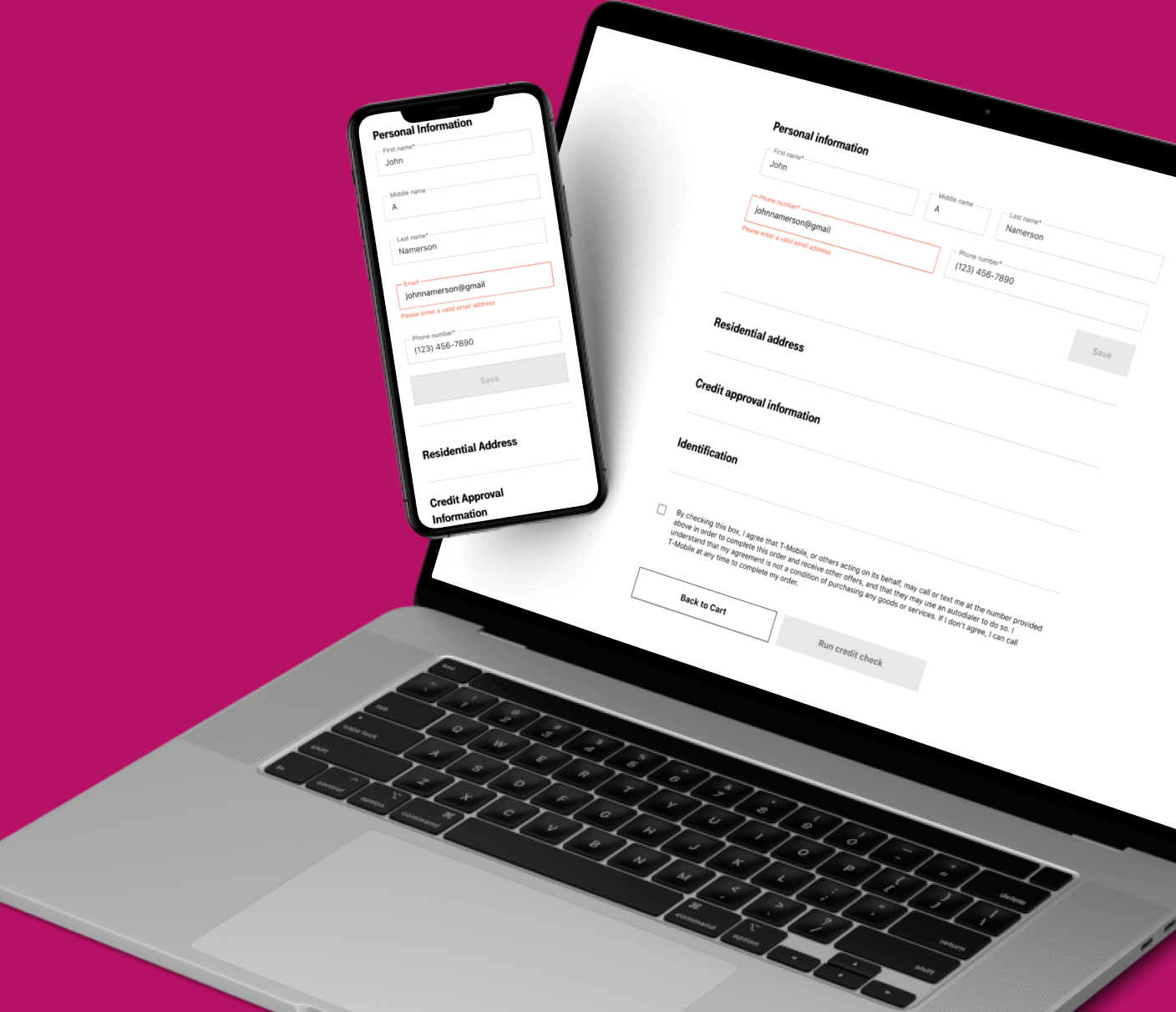
We had those long forms requiring customers to search for errors in the event that they cannot proceed to the next step. By implementing a progressive disclosure pattern we could surface errors sooner preventing users from needing to scroll up and down the page to find the error.

📈 Results
Company record of 94.25% of orders completed
56% reduction in customers in a dead end due to errors
Contribution to Magenta Styles in both componentry and processes

