Redesigning the storefront platform to be an inspiration and planning resource for travelers
👨💻My role:
Lead designer focusing on interaction design, visual design, design system contribution, prototyping and crossfunctional collaboration
Platforms: Responsive Web
Tools used: Pencil & paper, Figma, Jira, Airtable
CUSTOMER PROBLEM
🤬
Before purchasing travel products, travelers first need to establish where their budget can take them, when they should travel and when is a good time to purchase for that trip.
Defining the problem
-

✨ Lack of travel inspiration
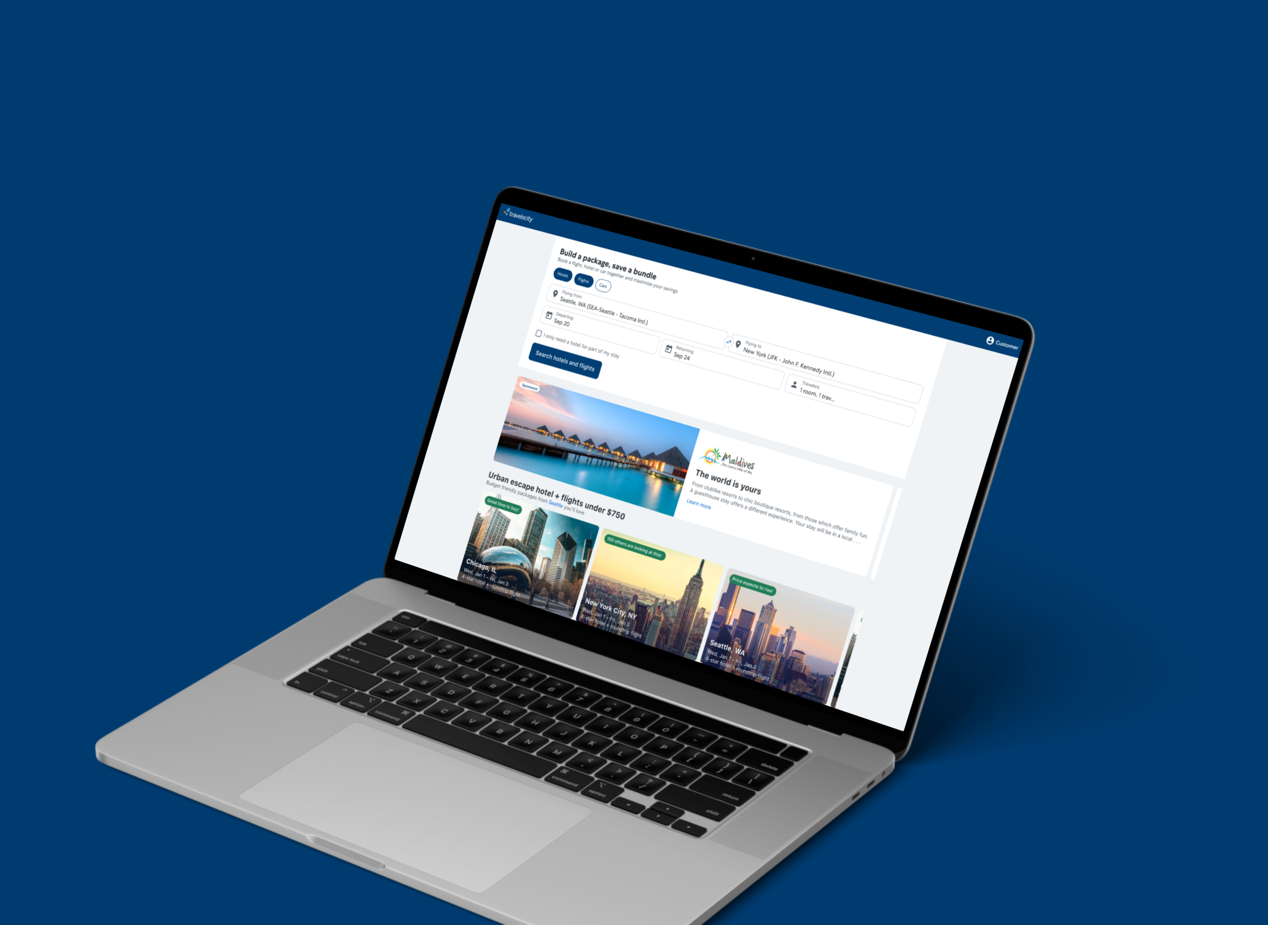
The legacy storefront did nearly nothing to inspire travelers to discover travel products. What was offered was seen as “salesy” in addition to being irrelevant. We sought out to surface a variety of travel products to learn about travelers and increase relevancy as they progress in their planning process.
-

🔬 No means to research
Once travelers are further in their trip planning process, they begin to research. Researching typically consists of gathering more detailed information about different destinations, products and pricing. Our goal was to surface the right information at the right time for travelers.
-

🔎 Antiquated search wizard
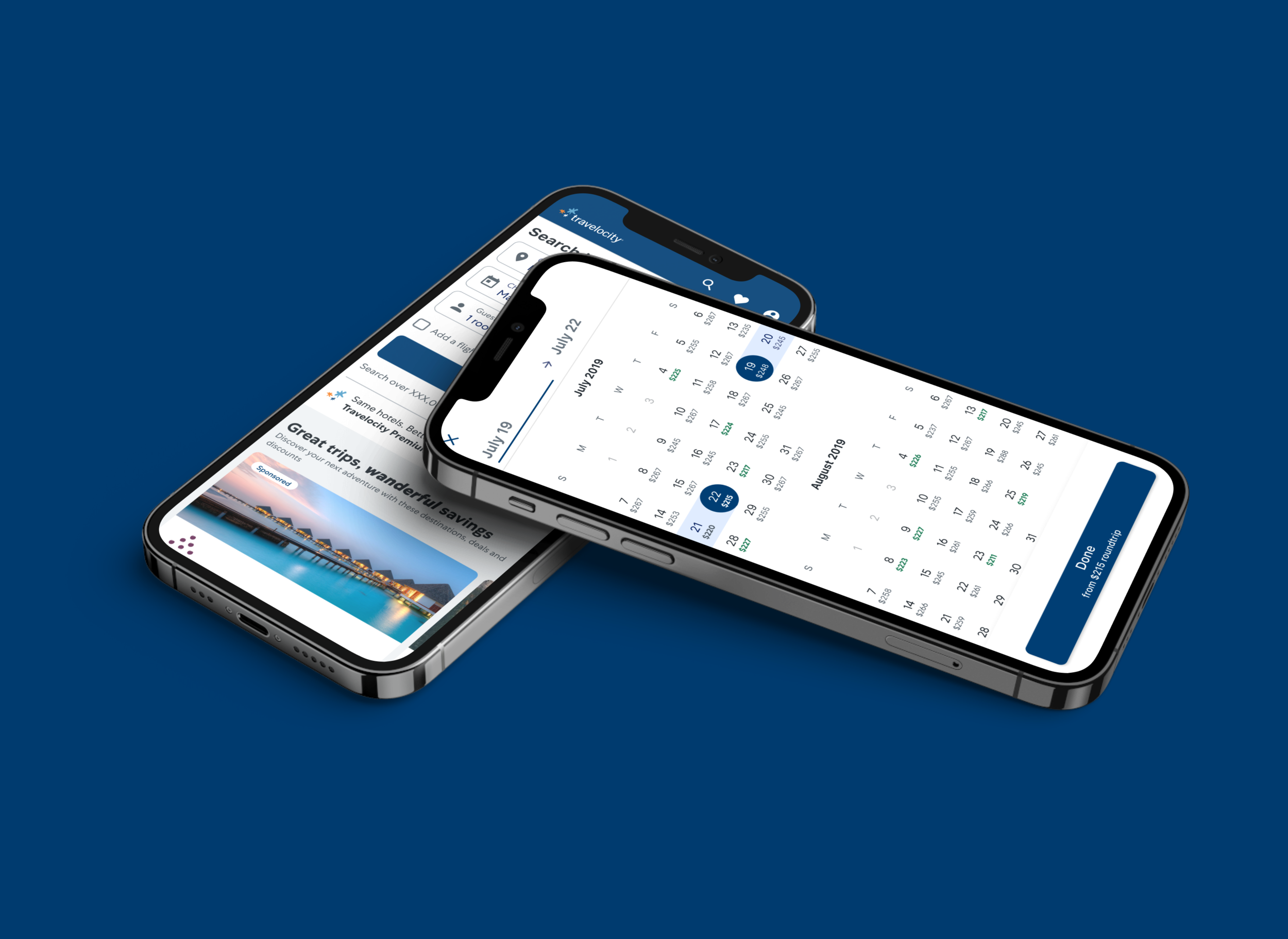
The search wizard was seen as the most successful component of the storefront page, still there was room for improvement. We set out to rebuild the search wizard with a new design system while also innovating to help travelers purchase travel products with more confidence.
BUSINESS OPPORTUNITY
The legacy storefront experience was optimized for customers who are ready to purchase a travel product. The problem is only about 8% of Expedia’s storefront traffic was ready to make one of those purchases.
🤔
How might we design a storefront to inspire travel, enable research and search for travel products with confidence?
✨
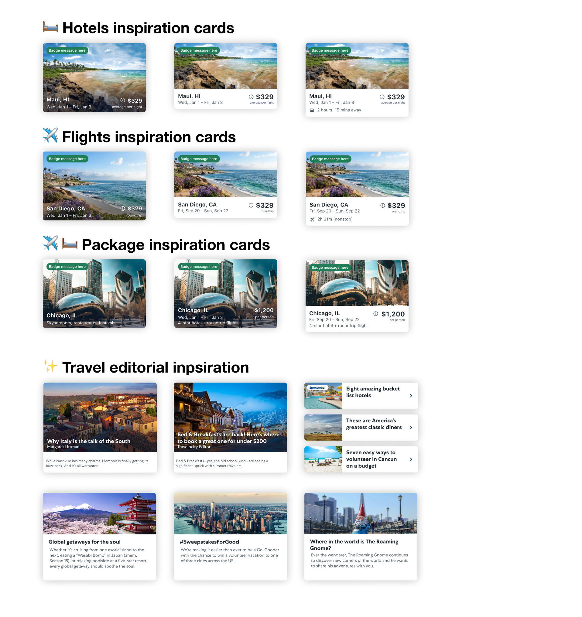
Inspiring travel
During the initial part of the trip planning process, travelers drift between active and passive dreaming. Together this was categorized as the inspiration phase. To offer value for travelers in this stage, I created a suite of travel product cards as well as editorial cards. These cards not only served to inspire travelers but also capture traveler intent to increase relevancy in future visits.
🔬
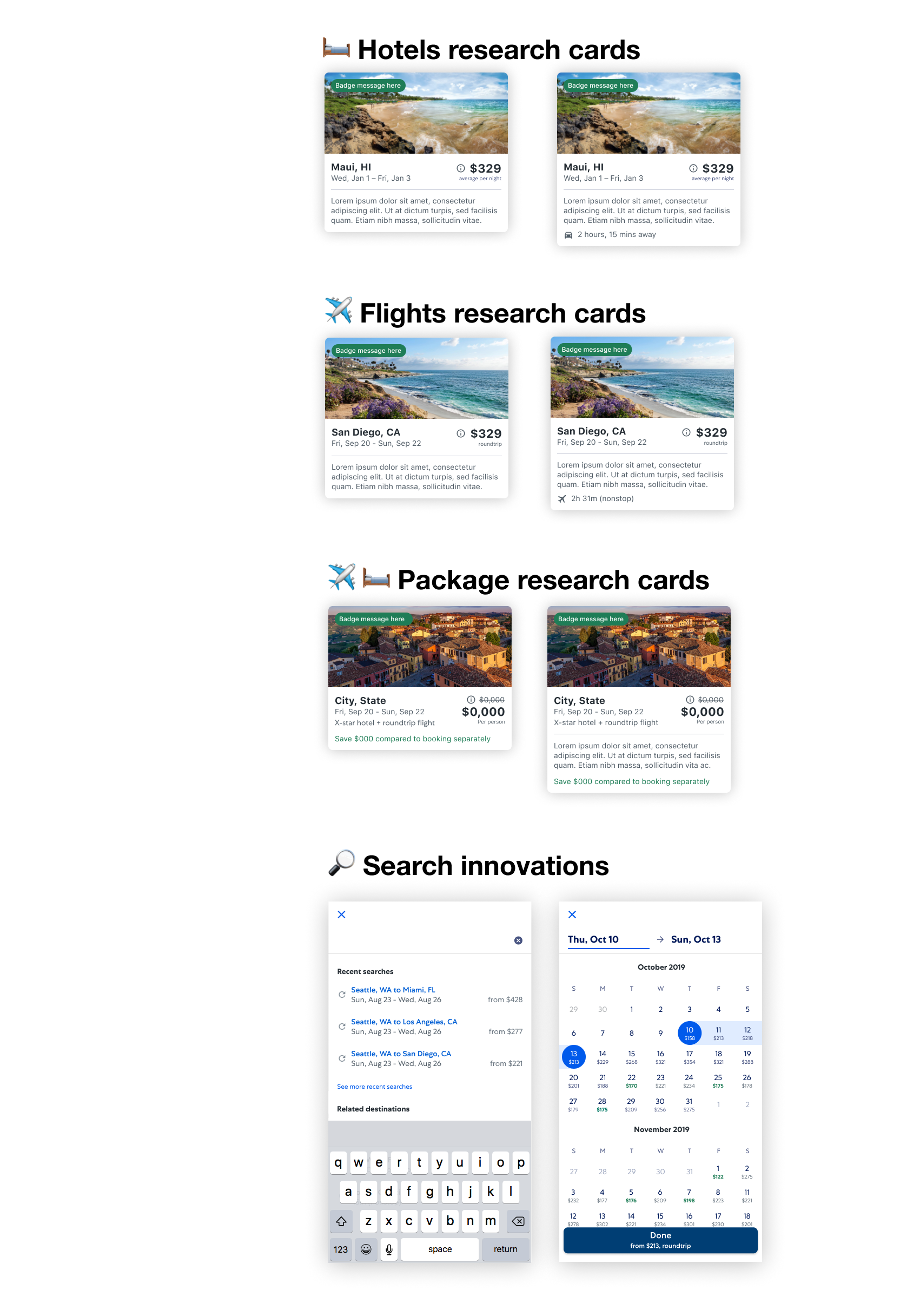
Enabling research
At this stage, customers are moving beyond the fantasy of travel and are more seriously considering the costs, timing (both when to travel and when to purchase) and other travel logistics. With this insight I designed more robust product cards with content intended for travelers more invested in their trip. Additionally, I explored different search innovations that enabled them to jump back into a past search and have more insights into pricing trends.
🔎
Modernizing search
The existing search wizard was seen as a successful component of the storefront pages. As the leading entryway to the shopping funnel, the goal was to modernize with subtle but delightful innovations such as an improved typeahead, modern UI with our shiny new design system and consistency across all lines of business.


📈 Results:
3.9% increase on conversion right out of the gate
11% increase in funnel progression
Configurable system of patterns and components that can be put together to become new pages
Designed and built to support future machine learning integrations


